Not everyone like's to read to much nowadays (thanks TikTok). See a comic strip?
Not everyone like's to read to much nowadays (thanks TikTok). See a comic strip?
Not everyone like's to read to much nowadays (thanks TikTok). See a comic strip?
Comic Strip
Comic Strip
Comic Strip
Paytm Chat
Paytm Chat
Paytm Chat
Social Payments for 500M+ Monthly Users
Social Payments for 500M+ Monthly Users

Tools: Figma ·Storybooks
Tools: Figma ·Storybooks
$500M+
$500M+
Monthly Users
Touch this Homepage
Monthly Users
Touch this Homepage
6 months
6 months
Start to
Launch
Start to
Launch

The Problem
The Problem
The Problem
I joined Paytm in 2020, right as UPI; India's real-time payments rail was reshaping the market. Paytm had been the default way to send money in India for years. Then Google Pay integrated UPI and added something Paytm didn't have: you could chat with someone while paying them. Users started migrating.
Paytm's answer was to bring that same idea to its own homepage: a surface that over 500 million people touch every month. Whatever shipped there wasn't a feature update. It was a brand statement.
I joined Paytm in 2020, right as UPI; India's real-time payments rail was reshaping the market. Paytm had been the default way to send money in India for years. Then Google Pay integrated UPI and added something Paytm didn't have: you could chat with someone while paying them. Users started migrating.
Paytm's answer was to bring that same idea to its own homepage: a surface that over 500 million people touch every month. Whatever shipped there wasn't a feature update. It was a brand statement.
The Brief
The Brief
The Brief
Understanding the Domain
We didn't just want chat-plus-payments. We wanted to go further than Google Pay had: bill splitting, group chats, group savings pools, and eventually using the same surface for conversations about investing — UPI as a starting point, not the whole idea.
We didn't just want chat-plus-payments. We wanted to go further than Google Pay had: bill splitting, group chats, group savings pools, and eventually using the same surface for conversations about investing — UPI as a starting point, not the whole idea.
The Caveat
The Caveat
The Caveat
Every component we built had to go back into Paytm's core design system; which meant every one of them needed legal, business, and management sign-off before it shipped.
Every component we built had to go back into Paytm's core design system; which meant every one of them needed legal, business, and management sign-off before it shipped.
Every component we built had to go back into Paytm's core design system; which meant every one of them needed legal, business, and management sign-off before it shipped.
Paytm had never had chat before. There was no bubble style, no message-state pattern, nothing to extend: we were defining primitives for the first time, in a domain (payments) that's about as regulated as consumer software gets in India. That's a real constraint most chat products never face: a "send" button isn't just a UX decision, it's a compliance conversation.
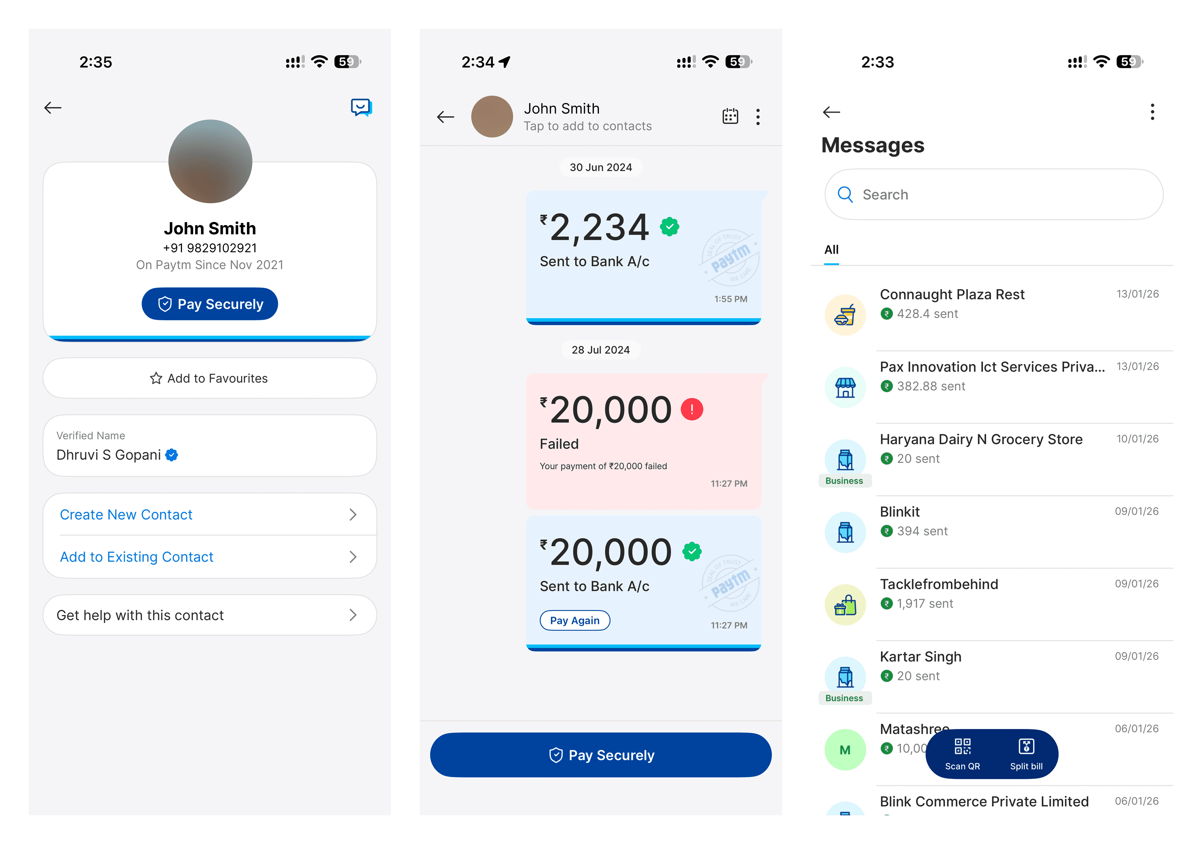
So we built deliberately, in public, with each new piece: chat bubbles, image sends, video sends, money sends, combinations of all of them checked at every stage rather than designed in a vacuum and approved at the end. Message states got the same treatment: sent, delivered, read, and reacted-to, each with distinct, tested visual treatment.
Paytm had never had chat before. There was no bubble style, no message-state pattern, nothing to extend: we were defining primitives for the first time, in a domain (payments) that's about as regulated as consumer software gets in India. That's a real constraint most chat products never face: a "send" button isn't just a UX decision, it's a compliance conversation.
So we built deliberately, in public, with each new piece: chat bubbles, image sends, video sends, money sends, combinations of all of them checked at every stage rather than designed in a vacuum and approved at the end. Message states got the same treatment: sent, delivered, read, and reacted-to, each with distinct, tested visual treatment.
What was shipped
What was shipped
What was shipped
End to end chat experience
A full chat-and-payments experience on Paytm's homepage: text, image, video, and money in one conversation thread, group chat with bill-splitting and group savings, and a foundation meant to eventually carry investment conversations too. A new component category added permanently to Paytm's design system, not a one-off feature.
A full chat-and-payments experience on Paytm's homepage: text, image, video, and money in one conversation thread, group chat with bill-splitting and group savings, and a foundation meant to eventually carry investment conversations too. A new component category added permanently to Paytm's design system, not a one-off feature.
Group bill-splitting
The obvious solution is a form: enter amounts, assign people, send requests. We wanted something that felt like what splitting a bill actually feels like.
So we built a pizza visualization: a shared bill shown as a pizza divided into slices (eight, in our design), portioned across three or four people based on who owed what share. Adjust the slices, adjust the payment split. It turned a financial form into something that looked like what you were actually doing at the table.
The obvious solution is a form: enter amounts, assign people, send requests. We wanted something that felt like what splitting a bill actually feels like.
So we built a pizza visualization: a shared bill shown as a pizza divided into slices (eight, in our design), portioned across three or four people based on who owed what share. Adjust the slices, adjust the payment split. It turned a financial form into something that looked like what you were actually doing at the table.
Reactions and stickers
Paytm Chat launched with a set of custom illustrated stickers. Built with the motion team, so sending money could carry an emotion, not just a transaction. Send someone money, and the interface could react automatically.
Every send also triggered an instant confirmation message stating exactly how much was sent and how fast. A small, deliberate detail proving Paytm's core promise: this is instant.
Ideas (everything, good or bad), Product Goals (merged into real-world actions), Users (scenarios)


The result
The result
The result
$500M+
$500M+
Monthly Users
Touch this Homepage
Monthly Users
Touch this Homepage
6 months
6 months
Start to
Launch
Start to
Launch
Post-launch, the team ran A/B tests through CleverTap with the research team to refine the experience further — I'd moved to Paytm's design systems team by that point, so I can speak to what shipped, not to how those later tests changed it.
Post-launch, the team ran A/B tests through CleverTap with the research team to refine the experience further — I'd moved to Paytm's design systems team by that point, so I can speak to what shipped, not to how those later tests changed it.
NOTE FROM FUTURE SAMARTH
NOTE FROM FUTURE SAMARTH
We designed every message state (sent, delivered, read, reacted) in real depth, and I still think that level of care is why the experience felt trustworthy fast in a category (payments) where trust is the entire game.
If I did it again, I'd push to stay through the A/B testing phase. I built the foundation and handed off before seeing what the data actually said about it, and that's the one part of this project I never got to close the loop on.
We designed every message state (sent, delivered, read, reacted) in real depth, and I still think that level of care is why the experience felt trustworthy fast in a category (payments) where trust is the entire game.
If I did it again, I'd push to stay through the A/B testing phase. I built the foundation and handed off before seeing what the data actually said about it, and that's the one part of this project I never got to close the loop on.
Always up for a conversation about UX, design systems or AI-native tooling
Always up for a conversation about UX, design systems or AI-native tooling
Always up for a conversation about UX, design systems or AI-native tooling
© 2026 Samarth Nayyar